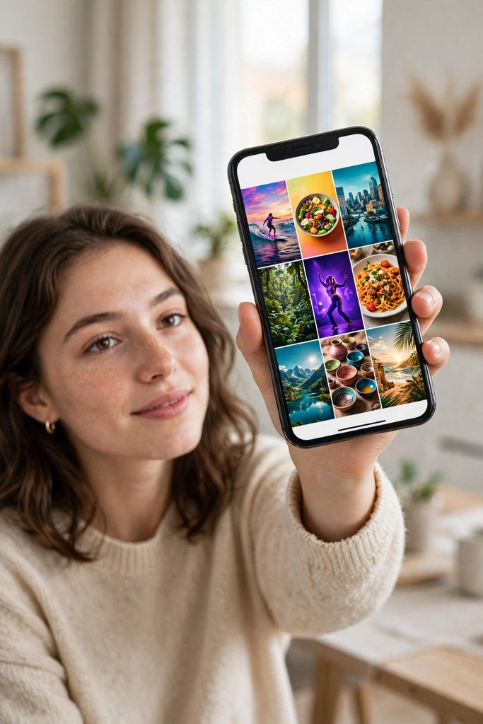
You open someone’s profile and, before you read a single caption, you already know what their page is about. The covers do the talking. One profile looks clean and organised, every cover clear and easy to read. Another looks like a pile of random freeze-frames, half of them mid-blink or mid-sentence, and you have no idea what any of the videos are about.
That is the job of a cover. It is the first thing people see on your profile grid, in search results, and in the explore feed. The video itself might be great, but if the cover looks messy, a lot of people will never press play to find out.
The good news is that making a good cover is not complicated. It comes down to picking the right frame, adding text people can actually read, and keeping things consistent. This guide walks through how to make a Reel cover photo for Instagram Reels, plus what changes for TikTok thumbnails and YouTube Shorts.
Quick Answer: How to Make a Reel Cover Photo
Pick the clearest, most expressive frame from your video, or design a simple cover image in the same vertical size as the video. Add three to five words of large, high-contrast text that says what the video is about. Keep the text inside the safe centre area so the grid crop does not cut it off, use the same colours and fonts across your profile, and check the cover on a phone before you post.
Picking the Right Frame
Your cover frame is the still image people judge the video by, so start here before you think about text or design.
Look for a clear, expressive moment
Scroll through your video slowly and stop at the frames where the subject is in focus, well lit, and facing the camera or doing something interesting. A reaction shot works well. So does the moment right before something changes — the “before” in a transformation, the setup before a reveal, the pause before a punchline. What you want is a frame that creates a small question in the viewer’s head: what happens next?
Avoid frames where someone is mid-blink, mid-word with their mouth half open, or half out of the shot. Those are the frames most apps pick automatically, and they are the reason so many covers look awkward. If your video is a screen recording or a text-heavy clip, pick the frame where the screen is stable and the key words are fully visible, not the frame where the text is still sliding in.
Check the lighting and the background
A frame that looks fine inside the video can look dull as a still image. Dark frames are the biggest problem. If the subject’s face or the main object is in shadow, pick a brighter moment instead. A busy background also hurts a cover, because the viewer’s eye has nowhere to land. The cleanest covers usually have one clear subject and a background that does not compete with it.
If your video has a section where the camera is steady and the subject is well lit, that is usually your cover moment, even if it is not the most dramatic second of the clip. Clarity beats drama on a thumbnail-sized image.
How to choose a frame on Instagram
When you get to the share screen on Instagram, tap the cover option before you post. You can drag along the video timeline to pick any frame, or tap “Add from camera roll” to upload a designed cover image instead. Take a moment here. This is the one step people rush, and it shows on the grid for as long as the Reel stays up.
If you have already posted a Reel and the cover is not working, Instagram lets you edit the cover afterwards from the Reel’s menu. It is worth fixing a cover you are unhappy with rather than leaving a messy one on your grid.
Designing a Cover Image Instead of Using a Frame
Using a frame from the video is the quick option. Designing a cover image gives you more control, and it is what most accounts with a tidy grid do.
Keep the design simple
A good cover design has three things at most: a background image or solid colour, a short line of text, and maybe one small element like an arrow or a number. That is it. When a cover tries to say everything — a long title, three stickers, an emoji border, a logo in every corner — nothing stands out and the whole thing looks noisy at thumbnail size.
Start with a still from the video as the background, then darken or blur it slightly so text on top stays readable. If the frame is already dark or busy, a solid colour block behind the text works better than trying to force text over a photo.
Make the text readable at thumbnail size
This is the rule that matters most. Your cover will usually be seen at the size of a postage stamp on a phone screen. Text that looks fine when you design it full-screen can turn into a grey smudge on the grid.
Keep the title to three to five words. Use a large, bold font — the text should fill a good part of the cover width. Use high contrast: white text on a dark background, or dark text on a light background. Avoid thin fonts, script fonts, and text in colours that are close to the background. And never put important words near the edges, because the profile grid crops the top and bottom of a vertical cover. Keep the key words in the centre of the image.
A simple test: zoom your cover down to the size of a thumbnail on your phone screen. If you can still read it in a second, it passes. If you have to squint or zoom in, shorten the words or make the font bigger.
For a deeper look at what makes people stop on a Reel in the first place, see this guide on how to increase views on Reels, where the first seconds of the video matter just as much as the cover that gets the tap.
Keeping Your Profile Grid Consistent
One good cover is nice. A whole grid of covers that look like they belong together is what makes someone follow.
Pick one style and stick to it
Consistency does not mean every cover has to look identical. It means they share something recognisable: the same font, the same text position, the same colour palette, or the same layout. Some creators always put the title at the bottom. Some always use a dark overlay with white text. Some use a colour-coded system, one colour per series or topic. Any of these works, as long as you use it every time.
The easiest way to stay consistent is to make one template and reuse it. Design your cover layout once in Canva, CapCut, or any editing app, save it, and swap in the new photo and title for each video. That takes a few minutes the first time and under a minute after that.
Think in rows of three
On a profile grid, covers appear in rows of three. Before you post, look at how your new cover will sit next to the two covers beside it. Does it clash with them? Does it repeat the same colour as the cover right next to it so the two blur together? A quick look at your own grid before posting helps you spot a cover that breaks the pattern.
This matters even more if you post series content. If you are making a series like the Take That Chance Reel or a repeating format, a consistent cover style tells viewers at a glance that the videos belong together, and it makes the series easy to find on your profile.
Do not redesign old covers for the sake of it
If your style changes, apply the new style to new posts. Going back and remaking every old cover takes hours and rarely changes much, because most profile visitors look at your newest posts first. The exception is a cover that is genuinely unreadable or misleading — that one is worth fixing.
Instagram Reels vs TikTok Thumbnails vs YouTube Shorts
The same basic rules apply everywhere, but each platform handles covers a little differently. Here is what changes.
Instagram Reels
Instagram shows your Reel cover on your profile grid and in the Reels tab. The grid crops the vertical cover, so the top and bottom get trimmed. Keep your text and the main subject in the middle band of the image. Instagram also lets you upload a custom cover image from your camera roll, which is the best option if you want a designed cover rather than a video frame.
TikTok thumbnails
TikTok lets you pick a thumbnail frame when you post, and you can also add text on the thumbnail itself. TikTok covers are seen in your profile grid and in search results. The same readability rules apply, and short text works even better here because TikTok viewers scroll fast. One thing to watch: TikTok’s own interface overlays sit on top of parts of the thumbnail, so keep your text away from the corners.
If you are repurposing a format across platforms, it helps to check how it looks on each one. A cover that works on Instagram does not always work on TikTok, because the crops and overlays are different. The October 2026 Instagram Reels trends guide is a useful check for which formats are worth adapting in the first place.
YouTube Shorts
YouTube Shorts works differently. For a Short, YouTube lets you choose a frame from the video as the thumbnail, and you pick that frame when you upload. There is no separate cover image upload for Shorts in the same way Instagram offers, so the frame you choose matters even more. Pick a clear frame with a readable expression or a visible key moment, and remember that Shorts thumbnails appear small in the Shorts shelf and in search. Big, simple visuals win; fine detail disappears.
For all three platforms, the principle is the same: the cover is a promise about what the video contains. A cover that matches the video builds trust. A cover that overpromises or has nothing to do with the video gets a tap once and a swipe away straight after.
Tools to Make Reel Covers
You do not need expensive software. These are the tools most creators use, and each one covers the job well.
- CapCut: Pick a frame, add text, and export the cover as an image. CapCut is handy because you are probably already editing the video there, so the cover stays in the same project. The GRWM Loading Reel walkthrough shows how CapCut fits into a full Reel workflow.
- Canva: The easiest way to build a reusable cover template. Set a vertical canvas, drop in a still from your video, add your title text, and save the design as a template to reuse. Canva’s free version covers everything a cover needs.
- Your phone’s photo editor: The markup and text tools built into the Photos app on iPhone and Android are enough for a simple cover. Crop the frame, add a text box, and you are done. This is the fastest option when you want to post quickly.
- Instagram’s built-in cover picker: No extra app needed. Choose a frame or upload an image right on the share screen. The built-in picker is the minimum — use it at least to avoid the automatic frame, which is often the worst one.
Whatever tool you use, save your template. Having the layout ready removes the excuse to skip the cover when you are in a hurry, and that is when the messy covers usually happen.
Common Cover Mistakes That Make a Video Look Messy
Most bad covers come from the same handful of mistakes. Here they are, so you can spot them before you post.
Using the auto-selected frame
When you skip the cover step, the app picks a frame for you, and it is usually a random one — a blurry transition, a half-finished gesture, a dark frame from the start of the clip. Always choose the frame yourself, even if it takes thirty seconds.
Too much text
A cover is not a caption. If your cover has a full sentence, a paragraph, or a list of hashtags on it, nobody will read it at thumbnail size. Three to five words. If the idea needs more words than that, the words belong in the caption, not on the cover.
Text that blends into the background
White text on a bright sky, yellow text on a yellow wall, thin grey text on a grey background — all unreadable. If the text does not pop against the image, add a dark overlay behind the text, use a solid colour block, or pick a different frame. Contrast is not a style choice; it is the difference between a cover that works and one that does not.
Misleading covers
A cover that shows something that never happens in the video might get a tap, but it loses trust fast. Viewers notice, and they are less likely to tap your next cover. The cover should be the most interesting honest frame from the video, not a fake one. A well-made cover for a strong video is a better plan than a trick cover for a weak one — and the guide on how to make a video go viral in 2026 makes the same point about hooks: the promise and the video need to match.
A different style on every post
Random fonts, random colours, random layouts — the grid ends up looking like a scrapbook. One template, used consistently, looks more professional even if the template itself is simple. A plain style done consistently beats a fancy style done once.
Ignoring the grid crop
This is the quiet mistake. You design a cover full-screen, it looks great, then you post it and the grid crops off the top line of text or the subject’s head. Always preview how the cover looks in the grid view, not just full-screen, and keep the important parts in the centre.
Formats with a strong visual moment, like the Zoom In Tiny Reveal Post, are a good test case: if the reveal frame looks clear as a cover, it usually works as a thumbnail too. If it does not, pick the frame just before the reveal instead.
Frequently Asked Questions
How do I make a Reel cover photo on Instagram?
Open the share screen after editing your Reel, tap the cover option, and drag along the timeline to pick a frame, or tap “Add from camera roll” to upload a designed cover image. Keep the text short and in the centre so the grid crop does not cut it off, then post as normal.
What size should a Reel cover photo be?
A Reel cover uses the same vertical shape as the video itself, 9:16. If you design a cover image, make it vertical at 1080 by 1920 pixels so it matches the video frame and stays sharp. Keep the important text and subject in the centre, because the profile grid crops the top and bottom.
Can I change a Reel cover after posting?
Yes. Open the Reel, tap the menu, choose Edit, and you can change the cover to a different frame or a new image from your camera roll. Fixing a bad cover is worth doing, especially if the Reel is one of your newest posts and sits at the top of your grid.
Should I use a video frame or a designed cover image?
A video frame is faster and works well when the video has a clear, well-lit moment. A designed cover image is better when you want readable text, a consistent grid, or a series look. Many creators use a frame for casual posts and a designed cover for series or important videos. Either way, choose the cover on purpose rather than accepting the automatic frame.
What text should I put on a Reel cover?
Three to five words that say what the video is about or what the viewer will get from it. Short phrases like a topic, a question, or a result work best. Avoid full sentences, hashtags, and small text. The cover text should make someone curious enough to tap, and it should be honest about what the video actually shows.
Do Reel covers affect views?
A cover does not change how the video performs once someone is watching it, but it does affect whether people tap in the first place — especially on your profile grid, in search, and in explore, where the cover is all people see. A clear, readable cover helps the right people find the video, and a messy or misleading one can put them off before the video even starts.
Final Thoughts
A good cover is a small job with an outsized effect. It takes a minute or two per video: pick the clearest frame, add a few readable words, and keep the style consistent with the rest of your grid. That is the whole system.
The creators whose profiles look the best are rarely doing anything complicated. They have one template, they choose their frame on purpose, and they check the cover on a phone before they post. Do the same, and your grid starts doing some of the work for you — every cover telling a visitor what the video is about and why it is worth a tap.
If you want to practise, start with your next three videos. Make a simple template, use it three times, and look at your grid. You will see the difference straight away, and from there the habit takes care of itself.